While this may look like a slightly more playful version of a regular font, those lines and letters have actually been designed specifically for dyslexia.
Dyslexia is a learning disorder that makes it harder for people to interpret words, letters, and sentences. While it does not affect a person's general intelligence, the condition can make it much harder for those who live with the disorder to maneuver language and communications that are like second-nature for everybody else.
After spending years struggling with his own dyslexia, Dutch graphic designer Christian Boer created a special font called Dyslexie as his graduation project from the Utrecht School of the Arts in 2008.
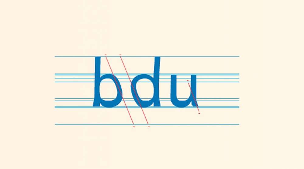
Dyslexie is a font that employs a dozen different different slants, curves, and styles that have been shown to help dyslexics to read.
The letters use several key characteristics that make them more discernible to dyslexics; for starters, the center of gravity is focused on the bottom of the letters to keep them being flipped upside down in the reader's mind. Letters that look similarly to each other have slight inclines and subtle changes in their shape so they're easier to differentiate. The words are also slightly spaced out in order to avoid "jumbling".
Studies on the font's efficacy have shown that dyslexics can read up to 84% faster, they make 77% less reading errors, and 76% would recommend using the font for other dyslexics.
The best part is that the font can be available for download in various text editors and web browsers either for free, or as little as $5.
Click To Share The News With Your Own Dyslexic Friends (Photo by Dyslexie)


Be the first to comment