Nightclub in Scotland Will Capture Energy From Dancers to Power the Venue
The pioneering BODYHEAT system at SWG3 could save the popular nightspot up to 70 tons of CO2 per year.

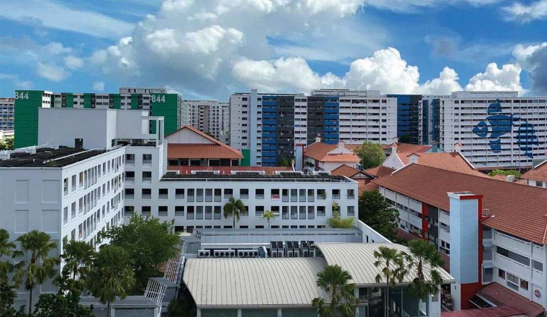
In keeping with the Singapore government's initiative to enable 'aging in place', a dementia-friendly wayfinding solution was devised for Khatib Central and Chong Pang City, which were identified as residential estates with aging populations.
The project's objective was to create a system that assists seniors and those afflicted with dementia in navigating around their neighborhoods safely and independently.
This was achieved by formulating wayfinding strategies that support easy navigation between residential blocks and key amenities around the estates, especially within high-traffic zones.
The estate was co-designed in 2019 by community stakeholders, healthcare partners and design consultants. 22% of Singapore's population is already over 60, and health authorities worry that there could be as many as 158,000 people with dementia by 2050.
Building upon research to ascertain the needs of the elderly and dementia patients, the resulting wayfinding solution involves zoning areas by color and symbol, as well as developing a signage system that allows easy spatial recognition.
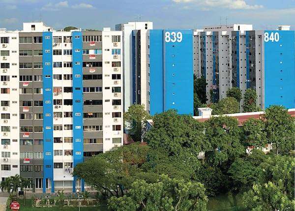
The residential blocks were sectioned into zones and each was assigned a bold colors, either red, green or blue. The zone colors were painted on the faí§ade of the blocks, along with block numbers prominently displayed in large fonts, making them easily legible from a distance.


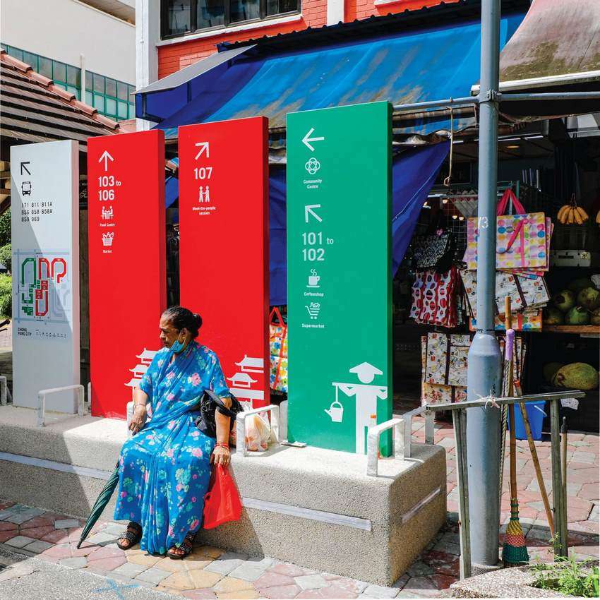
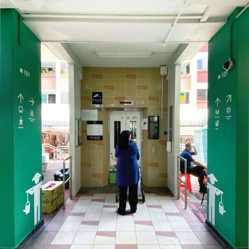
Other features of the wayfinding project include super-sized graphic walls and pillar signage that incorporate directional elements, universal icons, as well as stenciled symbols of pineapples, tropical fish and rubber trees, chosen for their close association with the area's heritage.
These simple yet distinctive visual cues serve as visual anchors for clear identification by color zone and are positioned at common areas such as lift lobbies and stairwells. In addition, directional signage on aluminum panels were integrated with concrete seats that double as resting spots for senior residents.
On the streets, barriers dissuade confused elderly residents from wandering into the main roads, while they also double as barriers to cyclists who are instructed to dismount and push their bikes along.
The signage system was applied seamlessly to the existing infrastructure, making for a community-friendly approach that prioritizes the well-being of the elderly demographic.
Locals caring for elderly relatives in the area note that there is room for improvements, for example the pillar signs are covered with perhaps too much information.
Beyond the large fonts and clear instructions, some signs or building facades are covered in large murals of everyday things and places. These depict things like the ang ku kueh, a tortoise-shell shaped traditional pastry that can help guide someone to the bakery.
SHARE This Modern Accessible City Planning On Social Media…
Be the first to comment